 PinDeck
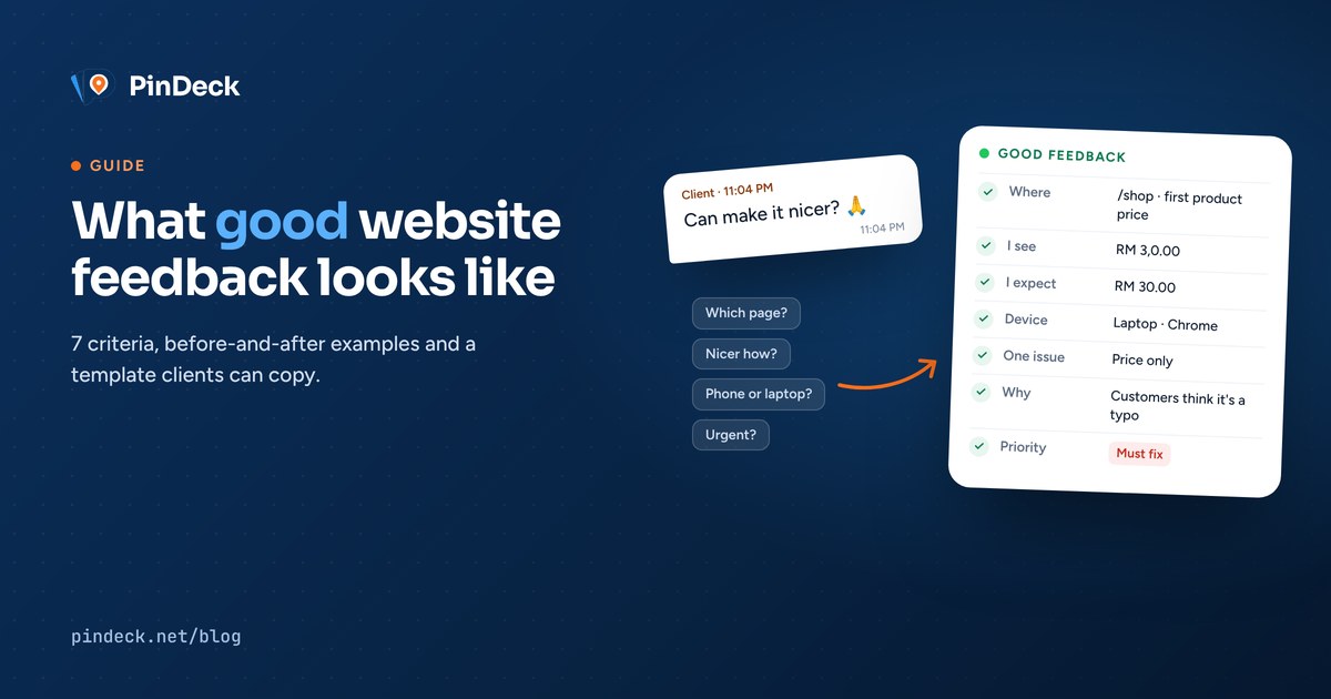
In my last post I looked at whether you actually need a feedback tool. The short answer was "it depends". But one thing came up in every source I read: the quality of the feedback matters more than the channel it arrives through.
A clear message on WhatsApp beats a vague comment in the fanciest tool. So this post is about the feedback itself. What makes it good, what makes it slow, and how to help clients give you the good kind without sounding like you're grading their homework.
- Where: the exact page and element.
- What you see: the current problem, described as a fact.
- What you expect: the result you want instead.
- Context: device, browser and screen size.
- One issue per item: don't bundle changes.
- Why it matters: the goal behind the change.
- Priority: must fix before launch, or nice to have.
Why feedback quality matters so much
Software teams figured this out decades ago. Mozilla's Bug Writing Guidelines say that steps to reproduce are the most important part of any report: if a developer can reproduce the problem, it's very likely to get fixed, and if the steps are unclear, it may not even be possible to know whether it was fixed.
Research backs this up. In a well-known study of Apache, Eclipse and Mozilla developers, researchers found a mismatch between what developers need and what reporters provide, with missing details often arriving only after several rounds of back-and-forth.
Client feedback on websites is the same problem with friendlier wording. Every missing detail becomes a follow-up question, and every follow-up question adds a day.
The 7 criteria of good feedback
Where: the exact page and element
This is the website version of "steps to reproduce". Name the page and point at the thing. "The orange button under the price on the Shop page" is good. A link to the page plus the button text is even better.
The button looks off.On /shop, the "Add to cart" button under the first product.
What you see: the problem, as a fact
Describe what's actually on screen, not how it makes you feel. Mozilla's guidelines put it well: clearly separate facts from speculation. "It's broken" is a conclusion. "Clicking it does nothing" is a fact a developer can test.
The form is broken.After I press Send, the page reloads but no thank-you message appears.
What you expect instead
A lot of revision rounds happen because the developer fixed the problem in a different way than the client imagined. Say what "done" looks like.
Make the logo bigger.Logo about the same height as the menu text, around 40px.
Context: device, browser, screen
"Looks weird" on an iPhone and "looks weird" on a 27-inch monitor are two different bugs. Mention the device and browser, or send a screenshot that shows the whole screen, not a cropped corner.
Menu looks weird.On my iPhone in Safari, the menu overlaps the logo when I scroll.
One issue per item
Mozilla's rule is "one bug per report", because different people often fix, verify and prioritise different problems. On small projects that's usually one person, but the logic still holds: a message with five changes gets four of them done and one forgotten.
Change the font, fix the photo, update the price and the footer is wrong.Four separate items, each with its own location.
Why it matters
This one is borrowed from people management. The Center for Creative Leadership's Situation-Behavior-Impact model asks you to explain the impact, not just the behaviour. In website terms: the goal behind the change. "Make it bigger" is a solution. "Older customers can't read the price" is a problem, and the designer may know a better fix.
Make the text bigger.Our customers are mostly over 50 and say the prices are hard to read.
Priority
Not every comment is equal. A wrong phone number blocks launch. A slightly different shade of blue doesn't. A simple "must fix" or "nice to have" helps everyone spend time on the right things first.
(no priority, everything feels urgent)Must fix before launch: phone number in the footer is wrong.
Before and after
Here's what that looks like on the kind of messages most of us receive, rewritten with the criteria above:
| Vague | Good |
|---|---|
| "Can make it nicer?" | "Home page hero: the photo feels dark and doesn't show our products. Could we use one of the bright shop photos instead? Nice to have." |
| "Price wrong" | "/shop, first product: shows RM 3,0.00. Should be RM 30.00. Must fix." |
| "Menu weird on phone" | "iPhone 13, Safari: the menu covers the logo after scrolling down. Expected the menu to stay below the logo. Must fix." |
| "Change the font" | "All headings: the font feels too playful for a clinic. We'd like something more formal, like the font on our printed brochure (attached). Must fix." |
| "This one. No wait, the other one." | A pin or screenshot on the exact element, with one sentence describing the change. |
Notice that the good versions aren't longer by much. They're just specific.
A template you can send to clients
The easiest way to get better feedback is to ask for it in a format. Send this to your client at kickoff. It works in WhatsApp, email or any tool:
Page: (link or page name)
Where on the page: (section, button, image or text)
What I see: (what's wrong right now)
What I expect: (how it should look or work)
Device / browser: (e.g. iPhone Safari, laptop Chrome)
Why: (optional: the reason or goal)
Priority: Must fix / Nice to have
You won't get all seven fields every time, and that's fine. Even three of them (page, what I see, what I expect) cut most follow-up questions.
Tips for developers and agencies
Good feedback is partly the client's job and partly yours. These make the biggest difference:
- Set expectations at kickoff. Explain how review rounds work, how many there are, and where feedback should go. Clients can't follow a process nobody told them about.
- Ask for one voice. If five people at the client's company give feedback, ask them to consolidate it through one person. Conflicting comments are worse than vague ones.
- Batch review rounds with a deadline. "Send all comments by Friday" beats a trickle of messages all week, and it protects your focus.
- Ask about the goal, not the taste. When feedback is "I don't like it", ask "what should this section make visitors feel or do?" You'll get something you can actually design for.
- Restate before you fix. For anything ambiguous, reply with your understanding: "So you'd like the price at 30.00 on all product cards, correct?" Ten seconds of confirmation saves a revision round.
- Close the loop. Let the client confirm each fix. "Done" should mean the client agrees it's done, not that you pushed a commit.
Tips for clients (share this part)
If you're a client reading this, thank you. Here's how to get your changes done faster:
- Review on the real website, not a screenshot of a screenshot. Click around like a visitor would.
- Point, don't describe. A link and a screenshot with the problem circled beats a paragraph.
- Give the final text. According to one large analysis of client feedback, content and copy changes are the biggest category of all. If you want new wording, send the exact wording.
- Say what's urgent. Your developer will happily fix everything, but knowing what matters most helps them start in the right place.
- It's fine to say "I'm not sure why, but this feels wrong". Honest uncertainty is useful. Just add where, and what you'd hope to feel instead.
Where tools help, and where they don't
A visual feedback tool can handle some of these criteria for you. In PinDeck, for example, a pin automatically records the page, the exact element, a screenshot, the browser and the screen size. That's criteria 1 and 4 done without the client thinking about it, and each pin is naturally one issue, which covers criterion 5. Statuses and the client's final check take care of closing the loop.
But no tool can write criteria 2, 3 and 6 for your client. What they see, what they expect, and why it matters still need a human sentence. That's why the template above is useful even if you never use a tool. (If you're still deciding on that, my analysis of tool vs no tool runs through the trade-offs honestly.)
Quick checklist
- Can someone find the exact spot from my message alone?
- Did I describe what I see, not just that it's "wrong"?
- Did I say what I want instead?
- Did I mention the device or browser if it's a display issue?
- Is this one issue, not five?
- Would the reason help the developer find a better fix?
- Did I mark whether it's a must-fix?
Sources
- Mozilla. Bug Writing Guidelines.
- Zimmermann, Premraj, Bettenburg et al. What Makes a Good Bug Report? IEEE Transactions on Software Engineering, 2010.
- Center for Creative Leadership, via Mind Tools. The Situation-Behavior-Impact Feedback Tool.
- Feedbucket. Client Website Feedback Analysis (vendor data).